

The fast changing brand communication trends globally is taking all spheres of work by storm, particularly in terms how we are consuming any or all forms of communication. Clearly content consumption is evolving with each passing day and so are the brands changing its communication strategy to mark their presence and making themselves relevant. This is no longer restricted just to UI design or a medium but it holds validated with the overall brand communication.
Given the consumption of most content has moved through a digital medium, the user experience becomes a key element in design. Being minimal is the core idea now being accepted by brands across the globe & being minimal is anything which is not over the top and not flashy.
This comes from the concept that if a design element doesn’t have a functional purpose it would not be recepted well by the audience and divert attention. Being minimal is mostly to capture attention yet not being boring. It largely focuses on content & layout which is easy to use and being represented as honest helping consumer to connect more.
The flat designs translate the form right in todays world where most consumption has moved through mobile phones. It has become important that the design is simple, flexible, easy to resize and adaptable to all screen types. This also helps the website and apps getting faster and more functional. The flat designs have largely been acceptable so much so that the consumers don’t really notice which is the point.
Back in the days brands had to focus on various other medium to seek attention from consumers. However the internet has disrupted this very thought process. There have been many instances of brands moving to flat branding which as per the research finding is that flat, clean, crisp & modern form of communication looks well represented on all devices.
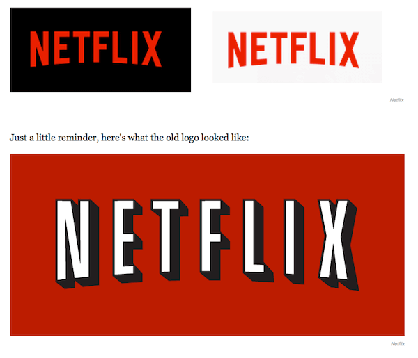
In case for Netflix the visual identity was introduced without the consumers actually noticing it. The new logo which has flat red on white logo and has no shadows but it still retains the curve in the text. The reason for the move was largely driven from the understanding that the app is being used on various devices and for each of these the older logo would have been not bright and unreadable. Therefore the move towards adapting a more subdued flat design which holds its ground on all devices.
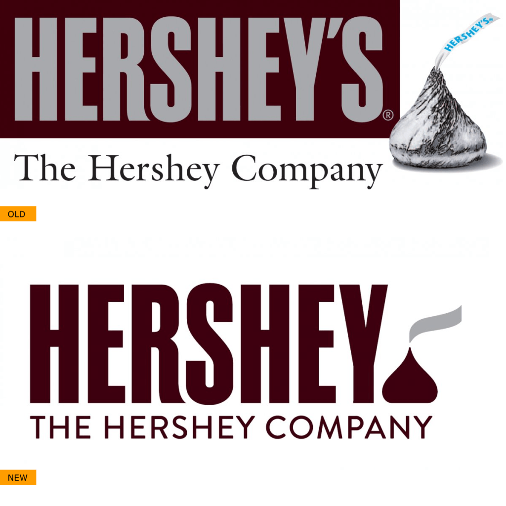
Hershey’s which moved out from its 3D logo form to offer consistency across all its products from packaging to communication with a clear direction to showcase that it is a chocolate company with the exclusion of ‘S;

Paypal’s new logo is about making a direct connection with its users in general. The intent is to depict commitment to its customers in not just its service but by being consumer centric through all form of communication.
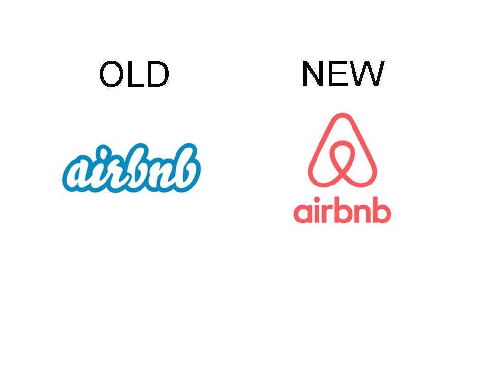
Airbnb’s desire to make itself more trendy & relevant was the strategy in making the move. Unlike Netflix, Airbnb went all out creating noise about the changeover exercise making it widely visible online and across all the devices. The move has been well accepted and loved by most.
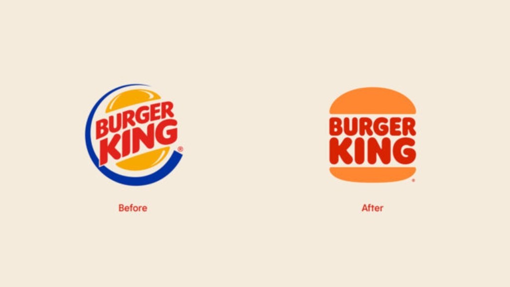
The changes in there new brand communication was witnessed across several medium from Logo’s, Packaging, Menu, Merchandise, In-store and digital communication. The conscious changeover was to ensure that the brand continues to stay evolved and relatable. There were a few inclusions earlier which was not relevant such as colour blue which is not a food colour and the bun’s don’t shine. The changeover largely communicates a direct connection with its consumers; positioning the brand as natural and friendly.
The change has just begun and world would continue to evolve be flatter.
–xx–xx–
