

As the saying goes “Beauty lies in the eyes of the beholder“, you see what you think. A human’s mind is programmed differently and is as stupid as interpreted. It often plays with eyes and makes you visualize more than what it actually means.
A piece of creative work is often altered to the fascination of many. This happened to India’s most popular Online fashion destination Myntra.
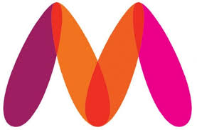
Myntra had to change its logo as above after a police complaint filed by an activist stating in its complain that the logo was offensive & insulting towards women. The brand changed its logo to ensure that there was no further escalation. While the brand has been subjected to a lot of meme floating on social media, the brand logo surely was trending through the day.
Interpretation: The logo resembles a lady with her legs spread. Hmm…. if the complaint is valid I am wondering why is the lady wearing two different stockings.

Here’s how the new logo looks. Interpretation the lady has corrected her mistake and now wears pink socks.
There has been many such instances in the past, where brands have irked the activists or individuals with extra creative bent of mind. For instance the logo for Airbnb, an online marketplace that connects people who want to rent out their homes with people who are looking for accommodations.

There have been critics who visualised the logo to be representative of a women’s reproductive organ. That’s a far fetched one from what the designer wanted to showcase. The logo is a combination of four simple symbols: a head to represent people, a location icon to represent place, a heart for love and then an A for Airbnb.
However, not all are as complex a logo to perceive and decipher the representation. Let’s take a check of beautifully designed child care center. The Arlington Pediatric Center, the stretched arms are trying to embrace but they now looks distorted to me.
The activist in me is now telling my mind, that have a look at this garish picture with a loud loud opposition.

After tackling the issue of the Pediatric center we have an alarming situation at hand. The logo which caught my attention is none other than a temple of learning. The Institute of Oriental Studies, University of Santa Catarina. It’s apparently supposed to be a pagoda, in front of the rising sun.

The learning center surely did not miss the epicenter of the sun. The beauty about gaining knowledge is that it makes you better with each day. The university learnt their mistake and withdrew it without any fuss.
From the temple of learning we move to discuss the work of the Catholic Church.

The logo was designed way back in the year 1973 and went on to win an award from the ART DIRECTORS of Los Angeles. Indeed a great logo which is representation of representatives of the Catholic Church.
Oh wait, am I the only one seeing it. Did the jury not see it while awarding this for design. The activists calls for a change and a pull down and it was granted.
Not all design need any analytical bent of mind to decipher the meaning. Some also need a perspective.
Here’s a representation and a rather innocent illustration of a dance classes. The two partners are rejoicing the music and the form.

A look from the far will make you wonder, what was the designer thinking.
We often hear about people going out of their way to do things and here is an example of one such case. The logo for Office of Government Commerce costed them €14,000 and they had to change it.
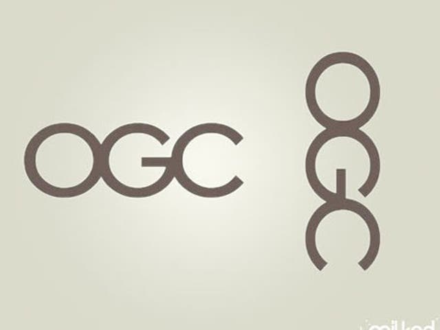
After the logo was placed horizontally.
The list can go on with illustrations by the creative and the thinker’s, but before I sign out I want you to see a gem.
To find a gem you may have to excavate i.e. put an effort. You may go on to look for Mont-Sat and die laughing.
–xx–
